Labels

Showing posts with label Process. Show all posts

Thursday, July 26, 2012

PRODUCT LOGO AND PRODUCT POSTER PROCESS

My partner Sonia and I had another conquest to conquer. We started to brainstorm how we would manifest a powerful product poster. We started of this process with getting used to photoshop and illustrator. Sonia and I split the sketch we chose into half and we created the sketch using illustrator and photoshop. My analytical drawing was of the bottom half of our sketch.


We then enraptured ourselves in the task of constructing a logo and company name. We decided on the name Vita Arco which was Latin for Life Protect. After we figured out out name we played with fonts and chose a font that was well suited with our vision. We revisited photoshop and illustrator and started to create our logo. We wanted a wave in our logo, but more of a abstract wave than a literal wave.


We created many different versions of our logo and narrowed it to one that we both loved and thought matched our prototype.


Wednesday, July 25, 2012

PRODUCT AND PROTOTYPE PROCESS

My partner Sonia and I started to imagine a product that could be used to help somebody stranded in the water. We started with a Venn Diagram, we wrote down some emotions that both of our events had in common. We wrote down what our events had in common.


From the Venn diagram we concluded that we wanted to do a safety device that would help somebody be safe when they are stranded in the water and need help. Sonia and I started sketching down ideas of what we thought would be a affective product. Sonia and I thought of a low tech product that would be portable.


This was our first sketch, witch was a life jacket that was attached with a inner tube that would inflate. The tube had pockets for the signal signs which were a foldable and attachable large SOS sign. The life jacket would have a hood which would zip up an create a triangular helmet to protect the head from water. There would also be a GPS chip in the tube.


Our second sketch had the same concepts as our orignal idea. Instead of a life jacket, we thought of straps instead so it would be easier for the person to swim. The sketch had all the same components as the other original sketch had


The last sketch we cultivated was very similar to our second sketch. This sketch id not include the head piece, we thought maybe the head piece would be in the way and was not a necessity. In the end we decided that sketch number 2 would be the best fit and we started on the prototype.
ANATOMICAL FIGURE PAINTING PROCESS

I created a figure drawing painting that would be the end result of a person who was affected by the Japan Tsunami if they were not protected by our amor garment. I chose a figure drawing that I drew with a soft pose.


I used radioactive isotopes to represent the anatomy of my figure. I sketched the radioactive isotopes on my figure and played with placement of the lines on my figure. After I sketched the radioactive isotopes, I painted the isotopes and my figure and completed my painting.
ERUPTION EVENT PAINTING PROCESS

Volcano Eruption Event Painting 
 I painted a picture that I thought expressed how I felt during my event. Through my painting I wanted to express how I felt like erupting while watching the Japan Tsunami. I had so many emotions and thoughts rushing through my head and exploding out of my mind. I choose to paint a volcano erupting, I thought that it was a perfect representation of how I felt. The picked an image to paint and get inspiration from. 
Original Picture 

I drew the volcano on a illustration board. Then I thought about contrasting colors that I wanted to use. I tested out color palettes in my sketchbook. 


I ended up choosing the colors Ultramarine blue, Electric blue, light purple, Ivory Black, Hot pink, Cadmium Red and Yellow. The black and blue contrasted really well with the hot pink, yellow and red. The final painting expressed exactly what I wanted. 

Tuesday, July 17, 2012

CONTAMINATED GARMENT PROCESS

I created a garment out of painted and printed drawing paper. The garment represented armor that I would be used to protect people from the Japan Tsunami. My motif in my event was corruption. I designed a armor like dress from the idea of corruption. I crafted a mood board that I thought represented the concepts that I wanted to explore and color choices that I wanted to work with.


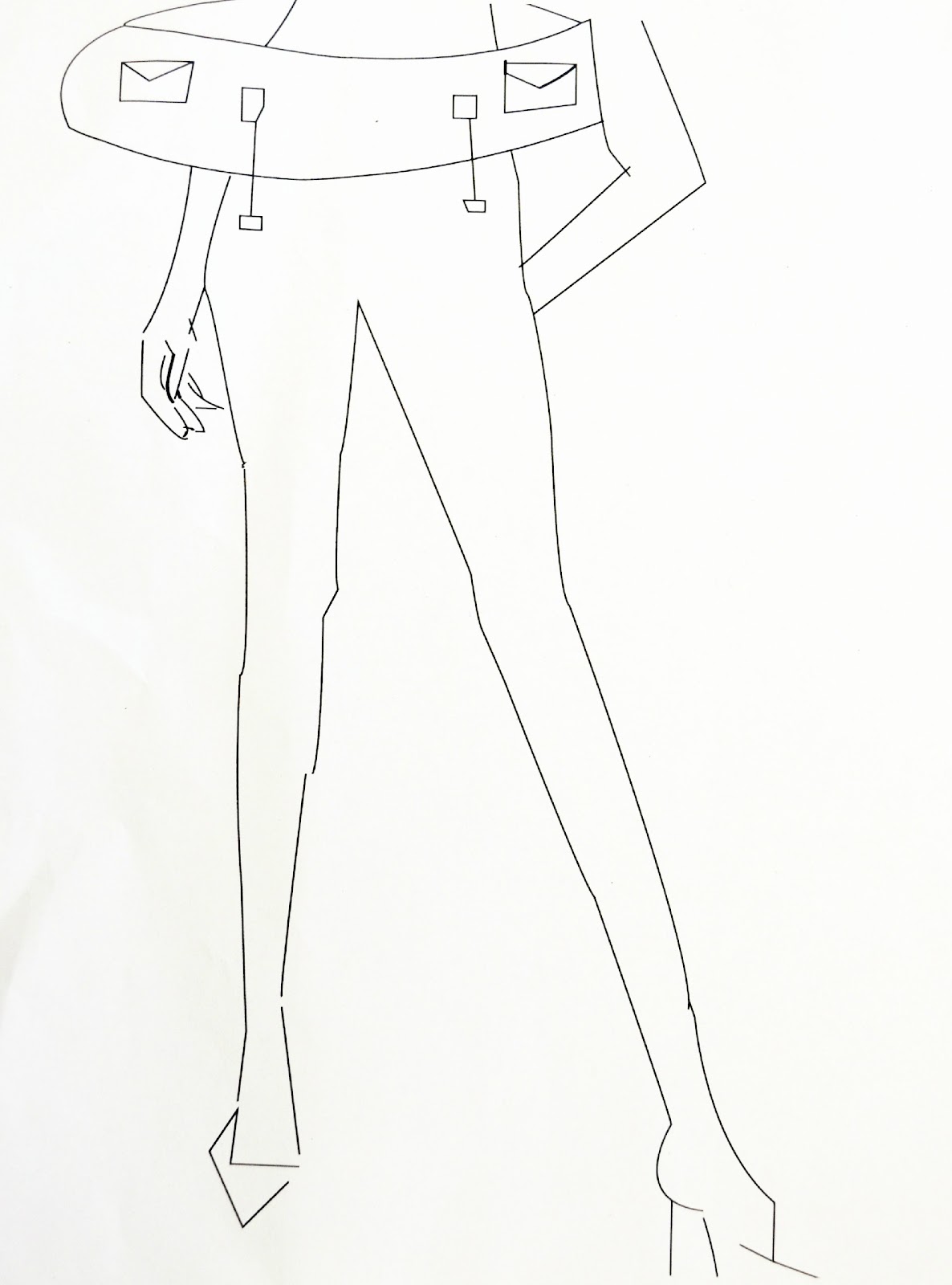
I started of creating a sketch of my design. I envisioned 3-D cubes in my design. I thought the use of
 3-D cubes on the garment would add a nice dynamic to my garment. I wanted to add an armor like boxy shape to my garment but still have a feminin touch to it. I envisioned using a print of flowers on my design.


At first I wanted to do a dress, but the amount of time that I had, I focused more on the chest piece. From the sketches I moved on to the lovely form. I never created a pattern before, so I grabbed a T-shirt and threw it over the form. I cut out pattern pieces of from the T-shirt fabric and made a pattern for my dress.


After creating the pattern, it got a little easier I just had to trace the pattern onto paper, cut out my pieces and tape/glue them together. Once I had my construction done....it got a little tedious. I started cubing like no other. I created 2 sheets of drawing paper worth of cubes. Drawing paper is 18 inches by 24 inches I think. After cubing like crazy. I painted the chest piece black. Then I cut out the flower print to fit the corset. I cut out and painted the black jagged geometric shapes then glued it to the corset. Then the glueing the cubes process began. Then I painted the cubes black on top. Lastly I added the cute little butterflies at the top.


Tadda!! 

Friday, July 13, 2012

CRUMBLING BOOK COVER PROCESS

I designed a book cover and created a special font for my book cover. I based my book cover of off how I felt toward the Japan Tsunami. The first thing I did was envisioning a font that I wanted to use on my book cover. I sketched down the font that I thought was appropriate for the book. I titled the book "Crumbling". 


After creating a font, I needed a picture that I was going to encorporate onto my book cover that related to my event. I imagined a pineapple all sliced up on my book cover. The shattered pineapple to represent how my vision of the water was shattered. I then went on a hunt to look for a pineapple in NYC. It was actually pretty easy to find a decent pineapple. I took some shoots of this epic pineapple. 


Photoshop and Illustrator were very helpful during this process. I cut the pineapple up using illustrator and collaged the image and my font to create my book cover. 

GREY SCALE PROCESS

I have never really worked with paint before. I painted a grey scale on a illustration board. I really experimented with the different shades of grey. I mixed black and white to come up with a gradiating grey scale.


I cut and pasted together a grey scale out of little pieces of grey, black, and white pictures and I had to figure out a smooth transition from white paper to black paper.


The most interesting part really was just getting to know paint and mixing colors. Figuring out things like adding the smallest dot of white paint makes a huge difference. Also things like how to make a color brighter or more dull. I painted a color wheel, from this project I really understood how to create a particular color you want to achieve.


THE CORRUPTED ABSTRACT PAINTING PROCESS

I wanted to design a black and white abstract painting inspired by how I felt personally toward the Japan Tsunami. I started with a mind map, I wrote down intense emotions that I was feeling throughout watching the tsunami. The mind map also included sensory experiences like what I heard, physically felt, and saw. 


From the mind map I selected a few words that I felt strong about. I choose the word corrupted, I felt that "corrupted" was the perfect word that represented how I felt. 

 I started sketching a design that represented a sense or corruption. I came up with 3 designs that I really liked, and then narrowed it down to one design.

1st Design

2nd Design

The Final Design (The Winner!)

The final abstract painting was painted on a 12 by 12 Gesso board. I changed the composition of the final painting and tweaked my original design.

Thursday, July 12, 2012

Aloha! The first "challenge" my class had to complete was to reflect on a event that affected us personally, locally, nationally, or globally. This "challenge" might have been easy for everybody...but I have a pretty blessed life and also a very non dramatic life. Some of my classmates had really dramatic events, involving kidnap, death, and crashes. I had nothing near tragic that happened to me personally compared to my class mates. I choose the Japan Tsunami for my event. Even though I personally did not experience the event, I was affected by the event personally. The Japan tsunami was very personal for my family and I. I am full Japanese and have friends and family all over Japan. When the tsunami occurred I was watching it happen from a live feed on the Japanese news. After watching the news with my mom and making sure my friends and family were okay, my view of water was corrupted. I always loved the water and most of my memories were with the ocean. What I thought was so pure, calming, fun, and whole turned out to be something powerful, destructive, and dangerous. My views of the ocean were corrupted from the tragic tsunami that I saw take away people homes and lives.

Beautiful Lanikai Beach, Oahu (My favorite beach)


Powerful an destructive Japan Tsunami